Hi Folks,
 This post will be the last in my Microsoft Word for Writers series. I hope you’ve enjoyed it and gotten some benefit from it. Of course, I’ll be back in about 10 days with a new post on a topic of interest to writers, self-editors and self-publishers.
Some have mentioned that I haven’t explained Microsoft Word’s styles function. That’s because this blog series is intended as a general guide to using Microsoft Word as a writer or editor, not for laying out ebooks or periodicals or other publications. However, I’ll touch on the styles function here just to round out the series.
Per my friend, Chris O’Byrne, “A style is a way of defining how a paragraph (or character) will look.” Working with styles is simply a matter of defining the style, and then applying the style. Let’s work up an example.
Say you want all the chapter heads in a book to be 18 point bold Helvetica. You want the chapter heads left aligned with no indentation and you want a 24 point horizontal space (blank line) before each chapter head and a 12 point space after it.
To Define the Style
in your menu (or ribbon) you would click the Home tab and look for Styles or Quick Styles. This is how mine looks:
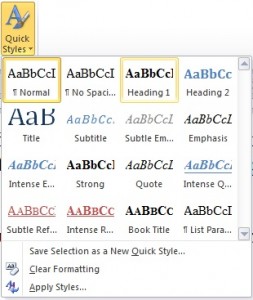
If you click the Quick Styles icon (in Figure 20 it’s on the right), you’ll get a pop-out menu that looks similar to this (please forgive the warped appearance of the final few pics in this post):
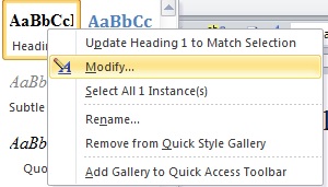
The third item in the top row is the Heading 1 style. If you right click that icon, in the ensuing dropdown menu you’ll see Modify.
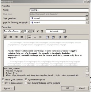
Finally, when you click Modify you’ll see this dialogue box:
As you can see, you can change the font face, size and attributes about 1/3 of the way down the dialogue box, but if you click Format at the bottom left corner, you can set the Font and Paragraph aspects as well as several other settings. When you’re finished, simply click OK.
To Apply the Style
once you’ve defined the style, you’ll select (highlight) each chapter head, then go to your Quick Styles menu and click Heading 1. Word will apply all aspects of the style to the selected text. Of course, you can also modify the definition of any of the styles in the Quick Style menu following the steps above.
The true benefit of using styles comes later. Say you decide you’d rather all the chapter heads would be 16 point Arial instead of 18 point Helvetica. Instead of selecting and changing each chapter head, you would simply right click Heading 1 in your Quick Styles menu and modify it to use Arial instead of Helvetica and 16 point instead of 18 point. Once you click OK, all the chapter heads would automatically change from 18 point Helvetica to 16 point Arial. It’s just that easy.
However, although such mechanical niceties certainly can come in handy when laying out a book or a periodical for publication, as a writer (or editor) that isn’t your job.
As I’ve been telling writers since the mid-1990s, in a manuscript you don’t want any special formatting. You don’t want exciting and flashy. You don’t want anything on the page to distract the reader (meaning the editor or publisher) from the story.
To prepare your manuscript for submission to agents, editors and publishers
First, use Times New Roman 12 point font throughout. No great mystery here. I recommend Times New Roman because if you use an em dash, it will show up as the right length. The manuscript should be doublespaced throughout.
The title of the overall work should be centered (no indentation) and in bold, but the prologue, epilogue (if any) and chapter titles and subtitles should be left justified (still no indent) and in bold.
The body text should be left justified in 12 point font, and the first line of each paragraph should be indented by 1/2″.
Use the paragraph formatting tool (see my post The Paragraph Formatting Tool) to set everything.
Here are some don’ts for you
- Don’t use the Tab key or the spacebar key to indent a paragraph as they take up valuable kbs and annoy editors.
- Don’t insert two spaces after a sentence. We aren’t using typewriters anymore. Add one space. Modern word processors adjust that space.
- Don’t use any special formatting, including underlining, oversized fonts, page borders, lines (rules), or shadows.
- Don’t use bold other than in titles.
- Don’t use ALL CAPS anywhere, including titles. Use italics (very sparingly) to indicate emphasis.
- Don’t insert a page break anywhere, even before beginning a new chapter. Just hit the Enter key an extra time at the end of a chapter to leave a blank line, then type the name of the next chapter, skip another blank line and begin the chapter text.
That’s it for now. Until next time, keep writing!
Harvey
Note: If you find something of value in these posts or on this website, consider dropping a tip into Harvey’s Tip Jar on your way out. If you’ve already contributed, Thanks!


